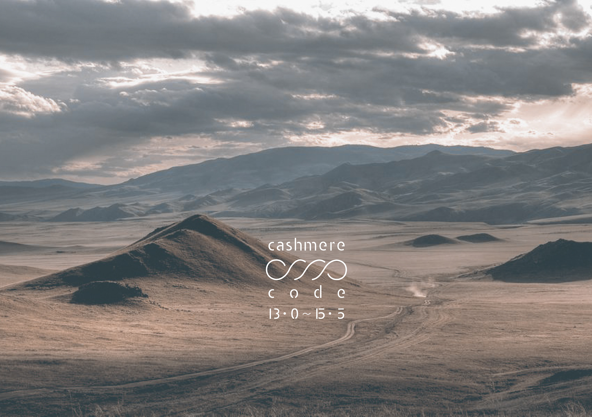
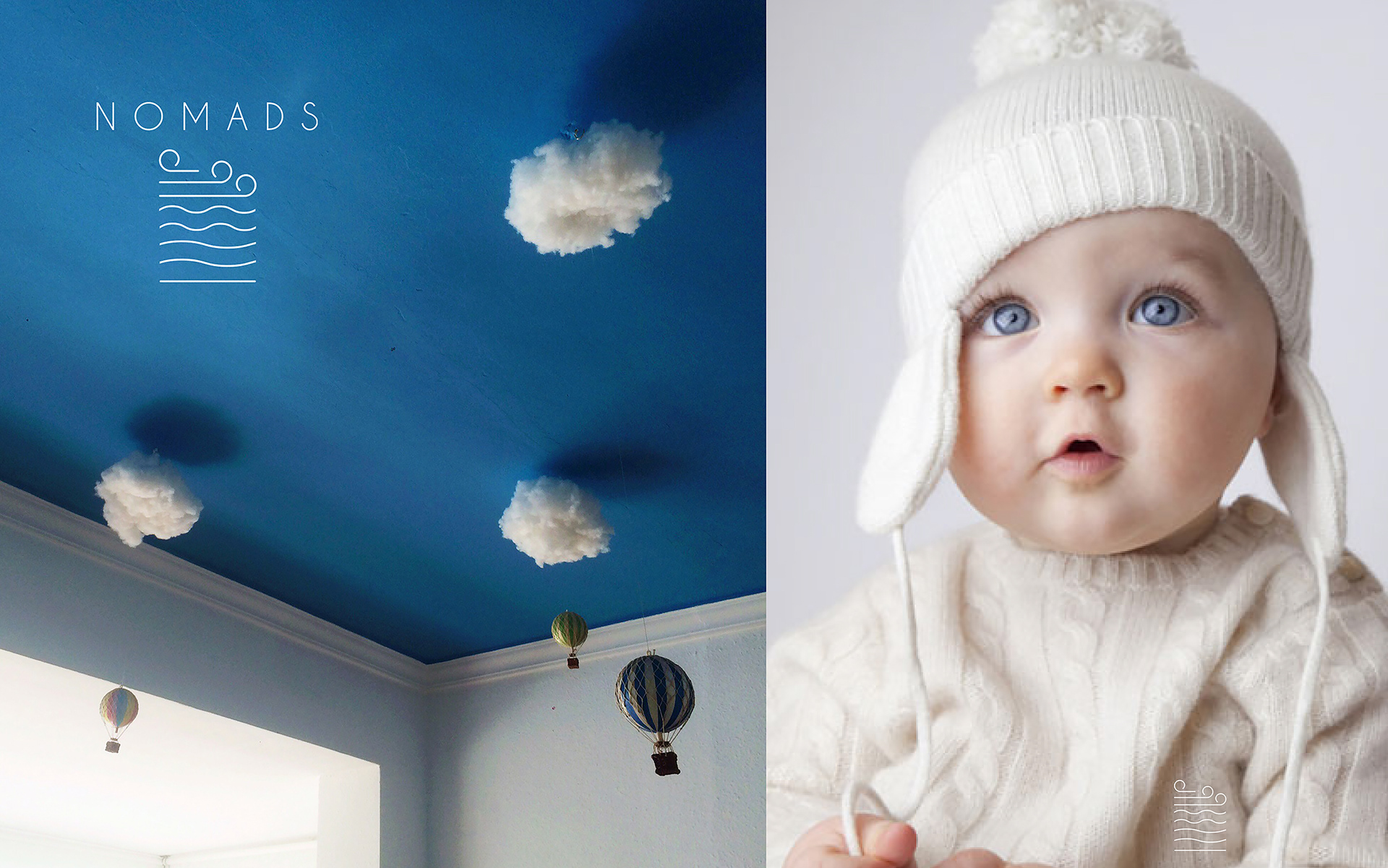
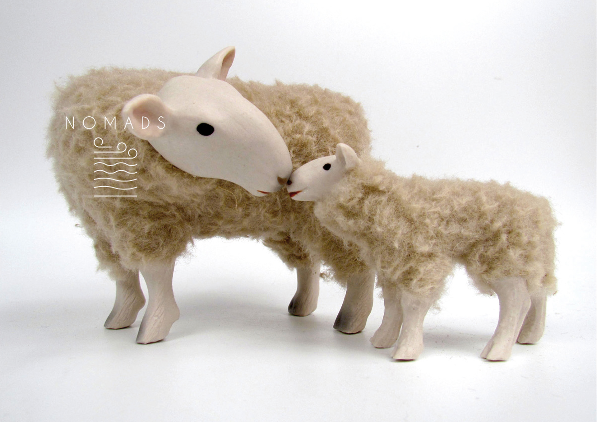
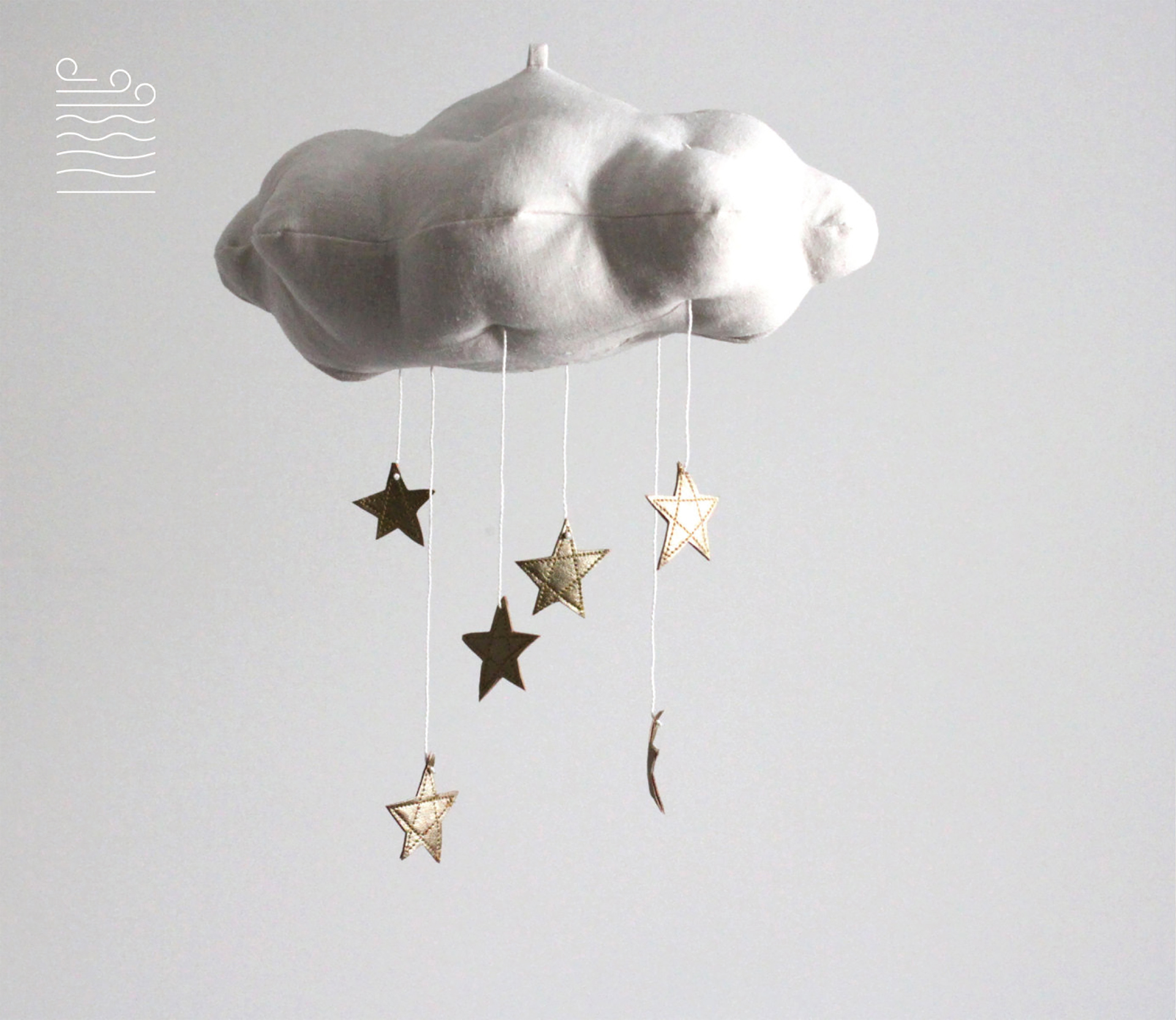
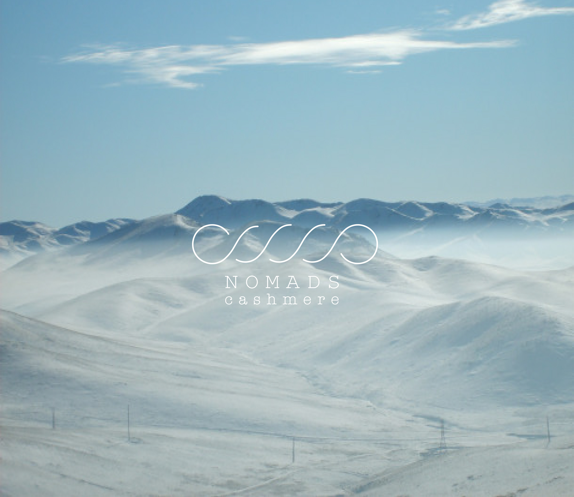
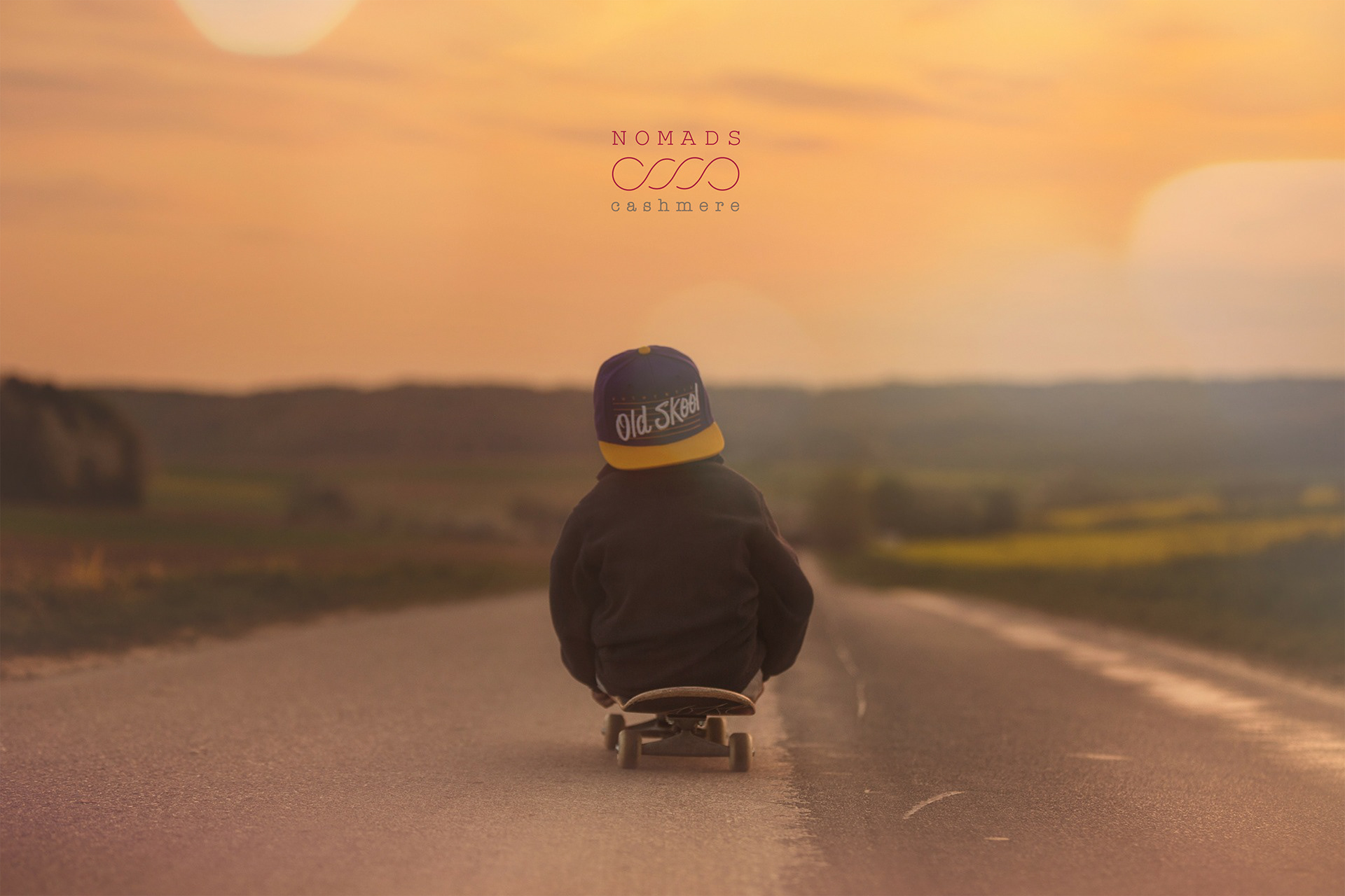
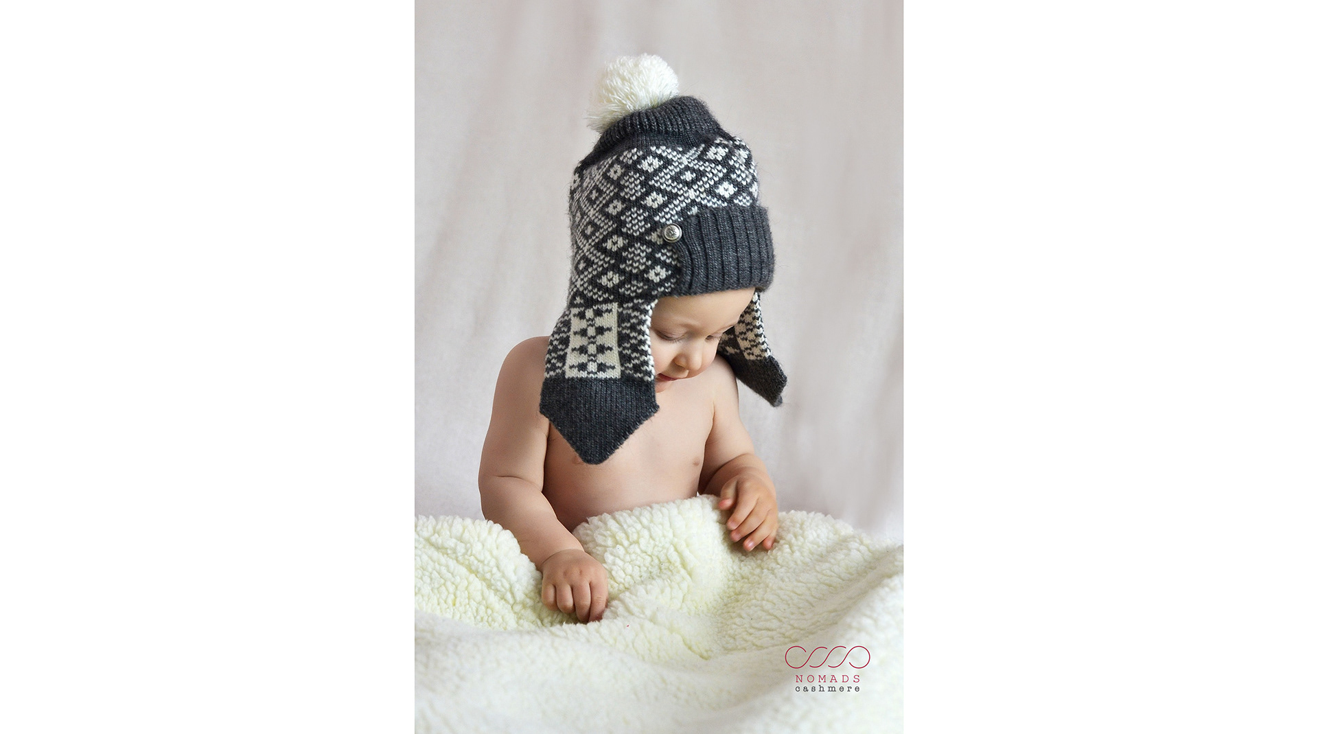
key visuals - proposal
During the creative process the client changed the name of the brand and asked for an adjustment in order to fusion different proposals.
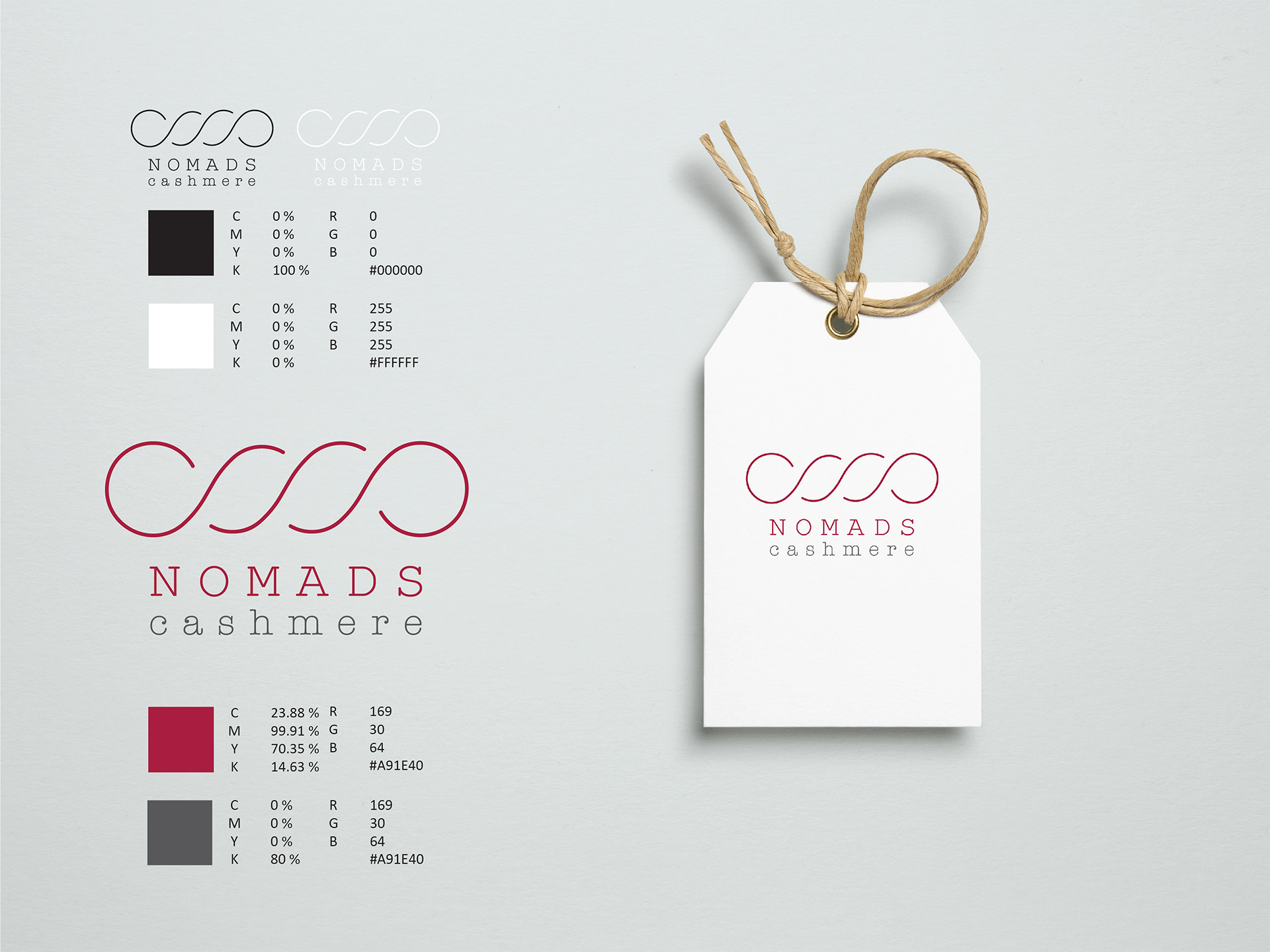
'Cashmere code' became 'Nomads Cashmere' and one of the first sketches were chosen by the founder to be consider as final logo.
From a version only based in positive and negative, it was asked to include a magenta tone and grey as principal corporative colours.
'Cashmere code' became 'Nomads Cashmere' and one of the first sketches were chosen by the founder to be consider as final logo.
From a version only based in positive and negative, it was asked to include a magenta tone and grey as principal corporative colours.
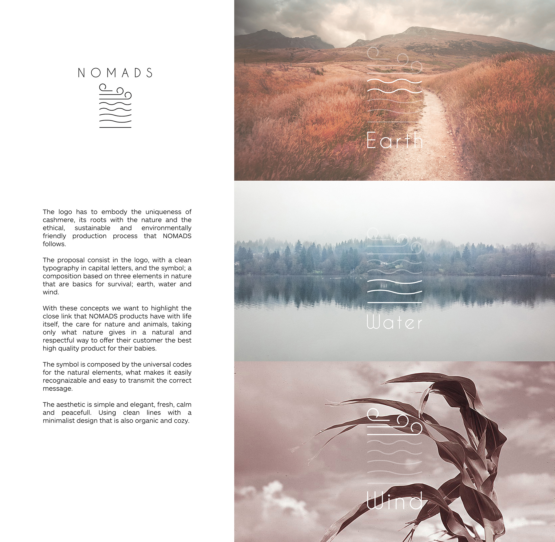
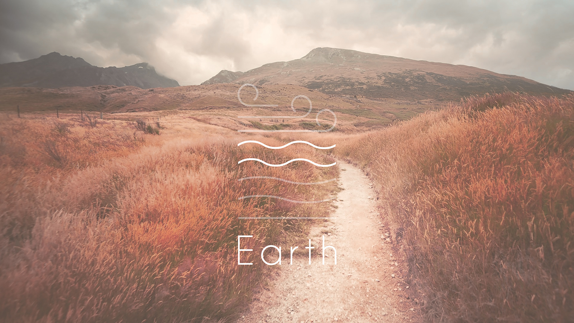
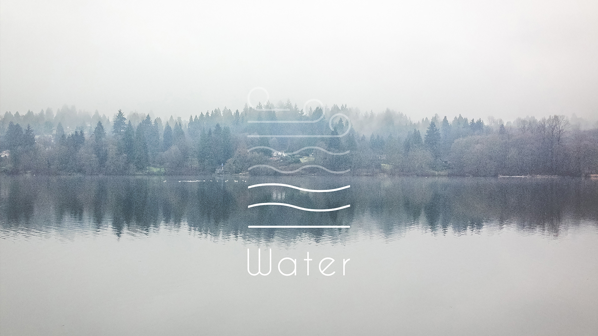
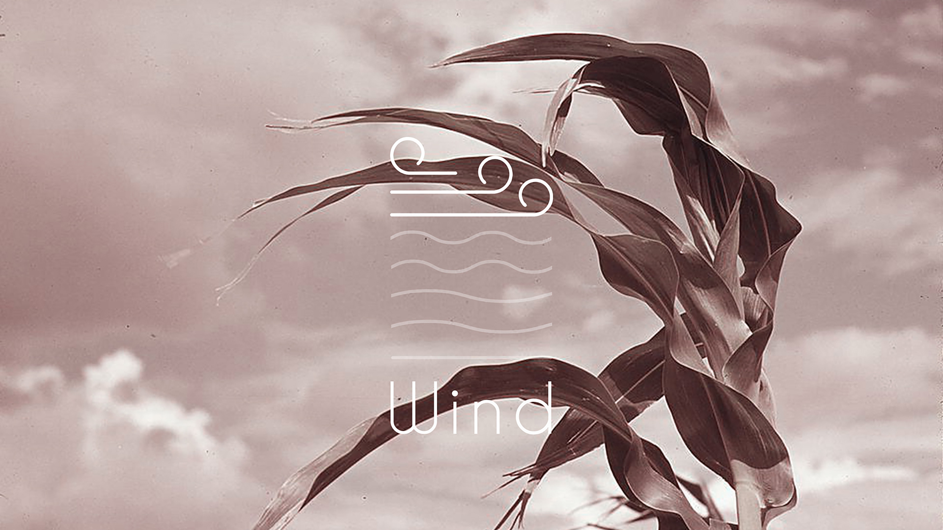
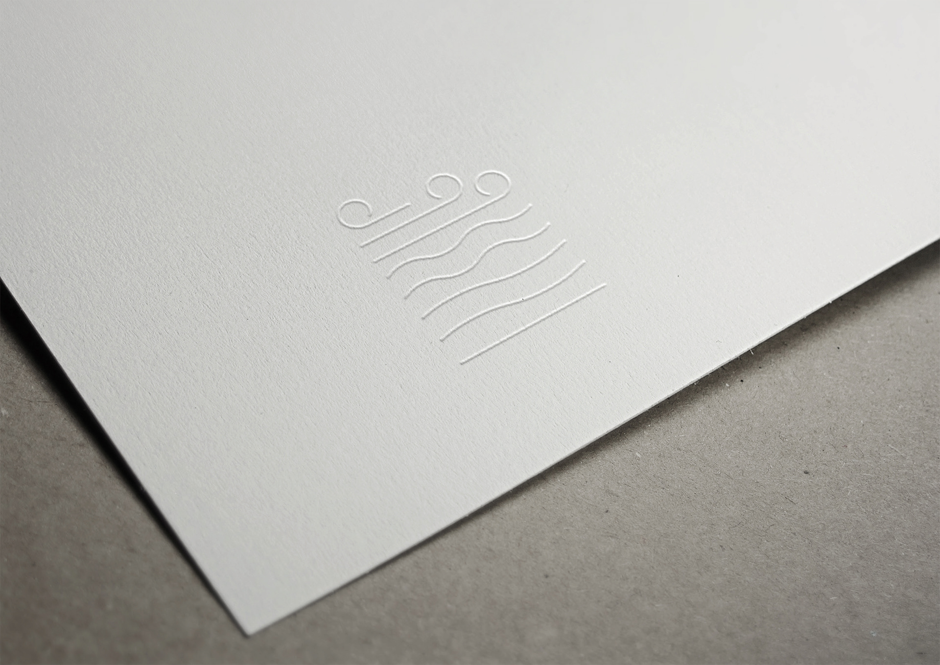
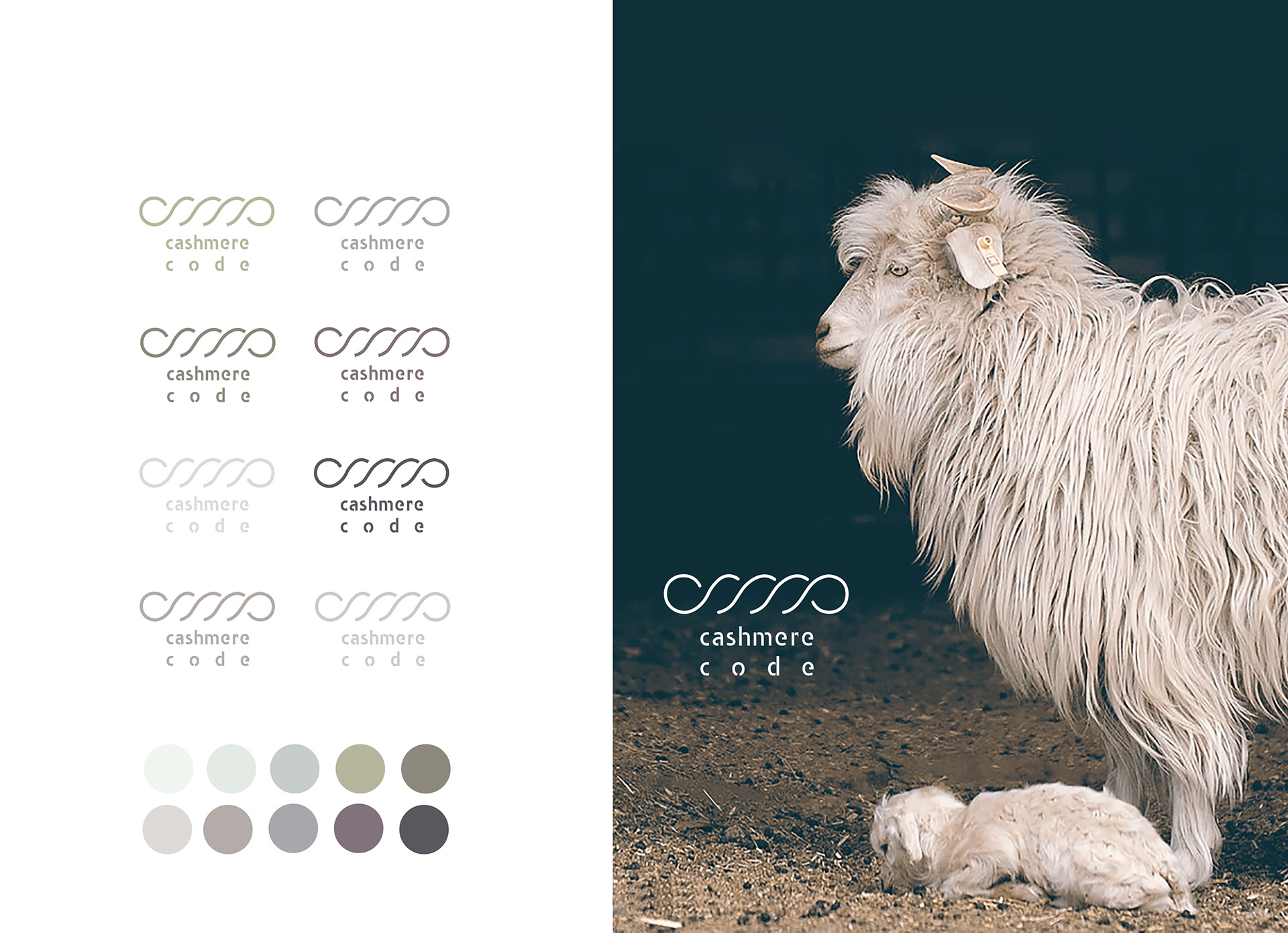
The symbol is a minimalistic interpretation of a skein wool, this is a general and recognisable sign that links the brand to its origins with a contemporary touch.
Final logo and corporate colours chosen by the client
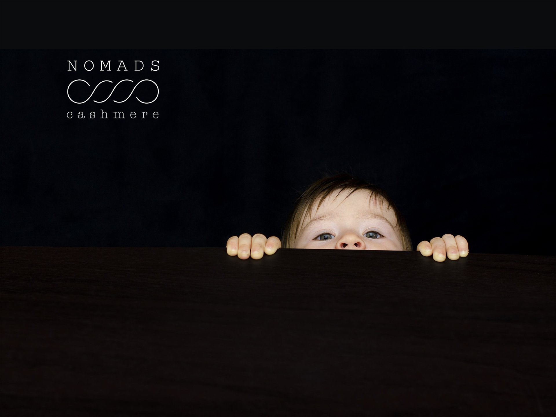
key visuals - proposal
discarded logos